SUNDARAM
Rebranding & Packaging Design

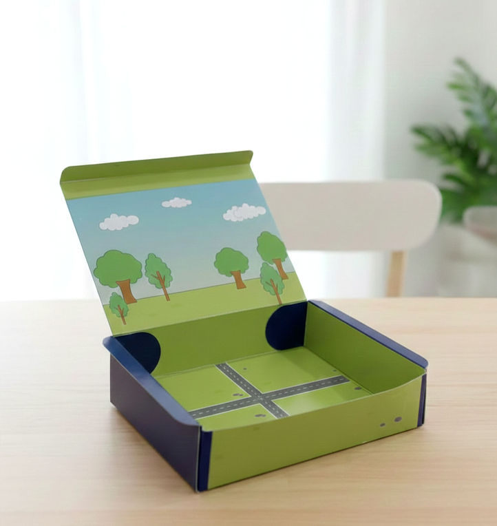
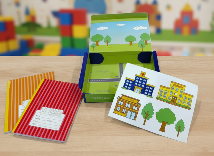
Sundaram was originally a book-focused brand, and this rebranding project aimed to expand it into a broader stationery line. The concept was built around school-going children as the primary target audience, keeping learning fun, friendly, and engaging. Along with refreshing the logo and visual identity, I introduced new product lines such as notebooks and stationery items. The central concept introduces a “build-your-city” model, where each product packaging contains interactive cutouts that allow children to assemble parts of a city. As students collect different books and stationery items, the city gradually grows turning learning materials into a playful, engaging experience beyond the classroom. The visual identity balances bright colors, simple illustrations, and structured layouts to keep the brand child-friendly while maintaining consistency across products.


